Willis Danielson
I'm a quantitative sociologist with interests in demography, urbanization, and environmental inequalities.
I'm a quantitative sociologist with interests in demography, urbanization, and environmental inequalities.
“There seems to be a public image of any given city which is the overlap of many individual images.”
—Lynch (1960:46)
In The Image of the City, Kevin Lynch asked residents to describe and sketch the cities they knew. From these accounts, he developed a taxonomy of five elements that structure the mental image of a city: paths, edges, districts, nodes, and landmarks. Lynch was primarily concerned with how people perceive, organize, and navigate urban space. However, I believe that aspects of his taxonomy are also visible in the physical growth of cities. Data-driven maps cannot reproduce the individual experiences that form a city’s public image, but they can reveal some of the spatial structures that help shape it.
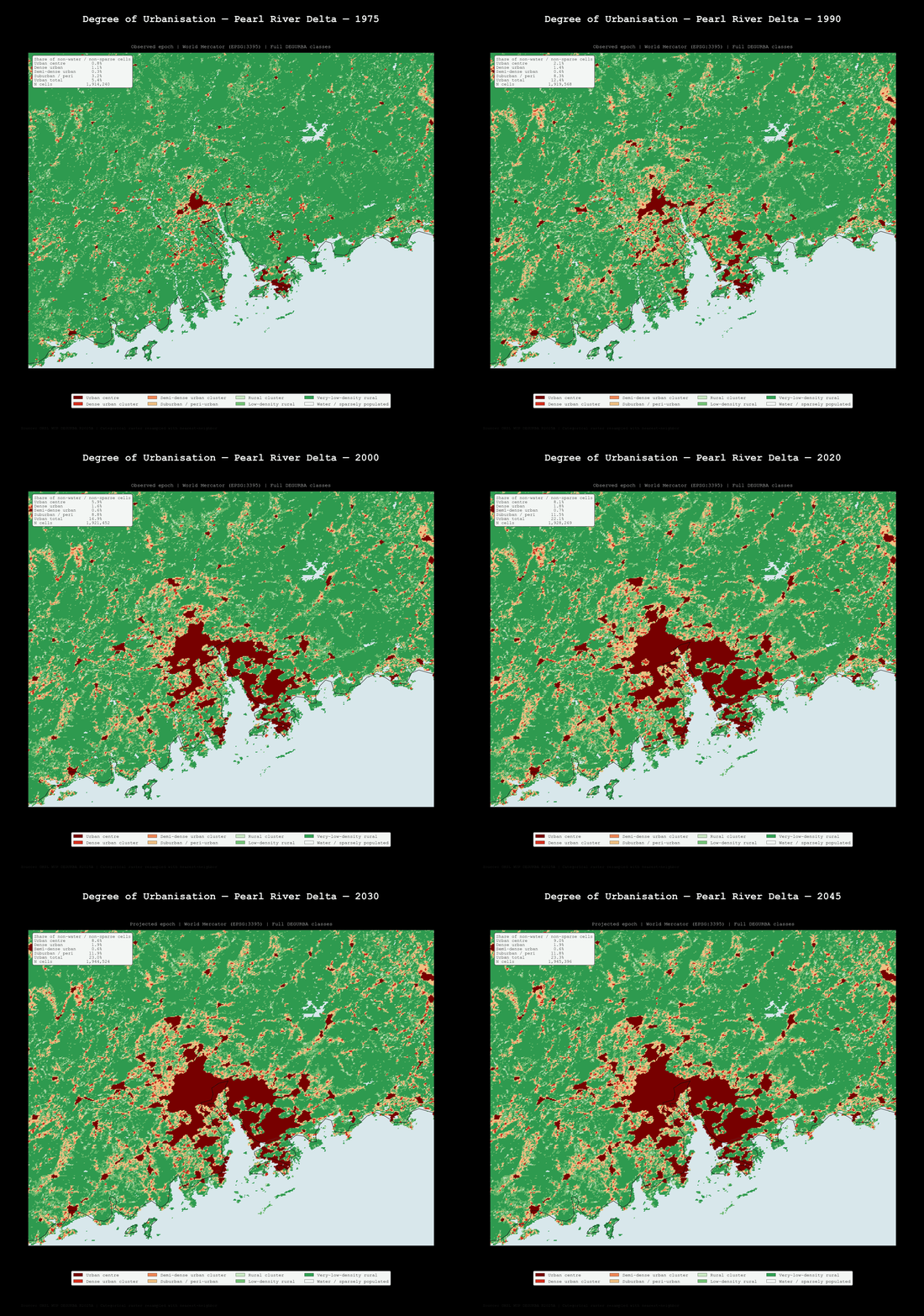
Using data from the Global Human Settlement Layer project, I created a series of maps examining several emerging megacities, along with a few other urban regions. These maps show urban agglomerations expanding around distinct nodes and districts. Over time, the paths connecting these concentrations become increasingly urbanized and are eventually absorbed into the larger built-up region.
| Pearl River Delta | | Lagos | | Hyderabad | | Wastach Front | | Tokyo |
_loop.gif)
When it comes to snow accumulation, the 2025 to 2026 winter season was among the worst ever for the Wasatch Front. I wanted to see if I could predict a reasonable SWE given how unconventional a season it was.
The model I used was simple. It used rolling 60-day windows of SWE observations as features along with sine and cosine features to encode where each date sits in the hydrological year (hy). The network consisted of a multilayer perceptron with two hidden layers (128 and 64 neurons). These layers used ReLU activations and a 15% dropout layer sat between them. Training data included SWE observations from the Brigthon SNOTEL site going back to the start of the 1988 hy. Leap days were removed so that each hy had the same length and a consistent day-of-season.
Normally, a trained network would produce the same output for every unseen input. To introduce uncertainty, I used Monte Carlo dropout in inference. The dropout layer remained active across 300 forward passes using the same input. This produced a distribution of possible futures for each forecast step. These predictions were condensed into three metrics: median, 10th percentile, and 90th percentile. Forecasting was recursive and each date’s median prediction was fed back into the model, that way every prediction step could use a complete window.
The first forecast was completed on December 22, 2025, and the process was repeated weekly through the 5th of April, 2026. The full sequence was rerun on June 23, 2026 so that each forecast round could be evaluated against the same set of observed outcomes.
Early in the season, the model predicted accumulation surprisingly well. But, the limited feature set left the model with no way to foresee the early melt phase. Past seasons that resembled the 2025 hy had an accumulation phase that extended into late March and beyond. The 2025 hy entered into its melt phase in mid-March. As such, the model predicted a SWE level that was below average, but closer to the median value and trend than observed SWE.
The model also failed when applied to other sites. When retrained on site specific data for the SNOTEL site near the Snowbird restort the MLP did not perform well. Changes to architecture also did not help improve the model. Improving generalizability will be my next step: a true ensemble of methods and an increased feature set that includes environmental features and target values from other sites.
In my mind, these simulations show evidence of three things. One, the start of the 2025 hy was below average, but actually rather normal. Two, the season's movement to the melt phase was historic and abnormally early. Three, it was the early melt that disrupted accuracy, not a low accumulation early season.
Uneven access to green space is an important sociological and environmental justice issue. Green space provides interrelated aesthetic, environmental, and public health benefits. Using data from the 2015 NYC Street Tree Census, I used the number of living street trees within a census tract as a proxy for neighborhood green space and examined its availability in relation to a tract's median household income.
As seen in the chart above, a simple OLS regression suggests a positive association between income and street tree counts. However, because the dependent variable is a count and there is heteroskedasticity, OLS is not a suitable model.
To better match the the data, I estimated a negative binomial regression with robust standard errors while controlling for several tract-level sociodemographic characteristics. Although this remains a relatively simple model, it is more appropriate for count data than a bivariate OLS regression.
After accounting for these controls, median income is no longer a statistically significant predictor. Instead, the proportion of White residents and the proportion of owner-occupied housing are significant. While this model cannot establish causation, it suggests that neighborhood differences in street tree abundance are associated with factors beyond income alone and highlights the importance of considering race, housing tenure, and other neighborhood characteristics when studying urban environmental inequalities in access to green space.
| Dep. Variable: | num_tree | No. Observations: | 2027 |
|---|---|---|---|
| Model: | GLM | Df Residuals: | 2018 |
| Model Family: | NegativeBinomial | Df Model: | 8 |
| Link Function: | Log | Scale: | 1.0000 |
| Method: | IRLS | Log-Likelihood: | -13375. |
| Date: | Wed, 30 Jul 2025 | Deviance: | 623.18 |
| Time: | 14:39:35 | Pearson chi2: | 464. |
| No. Iterations: | 30 | Pseudo R-squ. (CS): | 0.2132 |
| Covariance Type: | HC0 |
| coef | std err | z | P>|z| | [0.025 | 0.975] | |
|---|---|---|---|---|---|---|
| Intercept | 4.8999 | 0.054 | 90.698 | 0.000 | 4.794 | 5.006 |
| C(medIncCat)[T.1.0] | -0.0093 | 0.028 | -0.327 | 0.744 | -0.065 | 0.047 |
| C(medIncCat)[T.2.0] | 0.0416 | 0.035 | 1.196 | 0.232 | -0.027 | 0.110 |
| C(edu)[T.1.0] | 0.0694 | 0.045 | 1.542 | 0.123 | -0.019 | 0.158 |
| C(edu)[T.2.0] | 0.0793 | 0.049 | 1.621 | 0.105 | -0.017 | 0.175 |
| pctWhite | 0.0015 | 0.000 | 3.957 | 0.000 | 0.001 | 0.002 |
| tract_pop | 1.833e-05 | 1.93e-05 | 0.951 | 0.342 | -1.95e-05 | 5.61e-05 |
| shape_area | 8.152e-08 | 1.12e-08 | 7.258 | 0.000 | 5.95e-08 | 1.04e-07 |
| pct_own_occ | 0.0060 | 0.001 | 8.451 | 0.000 | 0.005 | 0.007 |
Learning a science is 90% learning the vocabulary and being able place yourself as an insder, but knowing what vocabulary is important can be difficult.
Starting from a list of LGBTQIA related terms collected from several advocacy groups, I wanted to understand the relative symantic importance of terms. To do so I used Wikipedia to constuct a node and edge graph that summarizes the hyperlink connections between terms on Wikipedia. Edges are bidirectional with an edge representing a link to or a link out of a term's wikipedia article.
Specialized fields and subcultures often have large and interconnected vocabularies, making it difficult for newcomers to understand which concepts are foundational and how ideas relate to one another. I wanted to explore an unfamiliar world through network analysis and visualize structures.
Starting from a collection of LGBTQIA-related terms compiled from several advocacy organizations, I constructed a node and edge graph using Wikipedia articles as the source of relationships between concepts. Each node represents a term, while edges connect articles that hyperlink to one another in either direction. The resulting graph provides a rudimentary map of how these concepts are linked.

Using data from the U.S. Census's Building Permits Survey and linearly interpolated population estimates, I was able to plot new residential building permits across a span of 16 years for all 50 states and the District of Columbia. I am always amazed that permitting appears to begin declining, almost across the board, years before the housing crisis came to a head in 2008. What is more, it is striking how similar the trend in housing starts for North Dakota matches with the growth of fracking and oil drilling in the United States.
